Potato Link
UX / UI REDESIGN

The PotatoLink software has been developed over many years and over that span has had features added and subtracted leaving the interface cluttered and confusing. Further to this, there has been an increase in installers using mobile devices instead of tablets on site which is now uncovering major accessibility issues with the interface.
How can we simplify the design and improve on accessibility to allow users to quickly access and understand the software?
TIME: Ongoing
TEAM: T. Vansleve
ROLE: UX / UI Design
DATE: June 2023
Project Goals
The purpose of this project is to understand the major pain points users experience whilst operating the PotatoLink software and to evaluate why the current interface is contributing to issues like poor accessibility and navigation confusion.
Tools & Methods


Overview
PotatoLink is software that was developed to help translink work with third party installers to continually update communications at bus stops and on public transportation routes. These updates range from the installation of temporary and permanent coreflutes, maps and lightboxes informing commuters about changes to their route. The software allows translink to log various bus stops into a “job run” for the installers to identify exactly which bus stops need changes and what exactly needs to be done at those stops.
User Groups
After completing initial user interviews it is clear that there is primary users and secondary users and both of their needs and goals are different. User personas were developed as a means to align everyone involved with a shared understanding of the desires and requirements, setting a solid foundation for the redesign process.

PRIMARY
Our primary users are the administrators. These users include Translink staff and PotatoLink management staff. These users are logging in the projects or 'job runs' for the installers to follow.
LIKES / WANTS:
- Auditing photos to record damage at any of the job sites
- Real time feedback of where installers are up to on job runs
- Being able to upload their own job runs with CSV files
- Optimised job runs so installers are using time efficiently
- Project costs summarys quoted in real time
FRUSTRATIONS:
- Titles and text don't make sense throughout the interface
- Layout is messy and doesn’t look cool or modern
- Lots of unnecessary information and text fields that we don’t use
- Button layout and top navigation is confusing
- Buttons are too small
SECONDARY
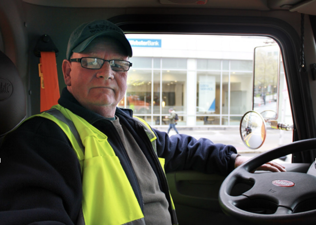
Our Secondary users are the installers. These users are the workers on the ground who are using potatolink as a map and job run guide to install the appropriate communication materials.
LIKES / WANTS:
- Want to be able to use mobile out on site easily
- Likes that when you click on the current map preview is starts directions in google maps
- Likes optimised jobs runs
- Likes being able to add in auditing images
FRUSTRATIONS:
- Buttons are too small and are hard to use
- Text too small, hard to read whilst out on site
- Isn't tech savvy and doesn't want to learn new software
- Doesn’t understand what most of the text fields and tabs do
- Terminology is confusing
The Current UI
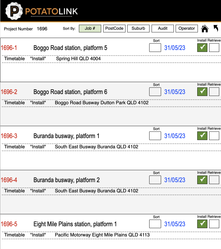
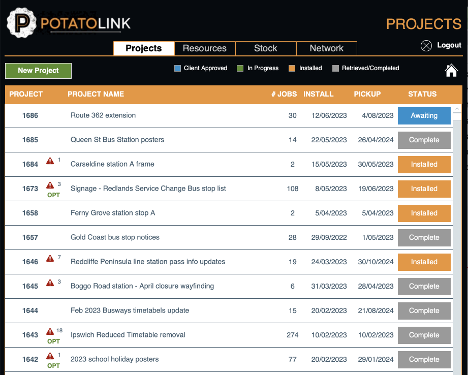
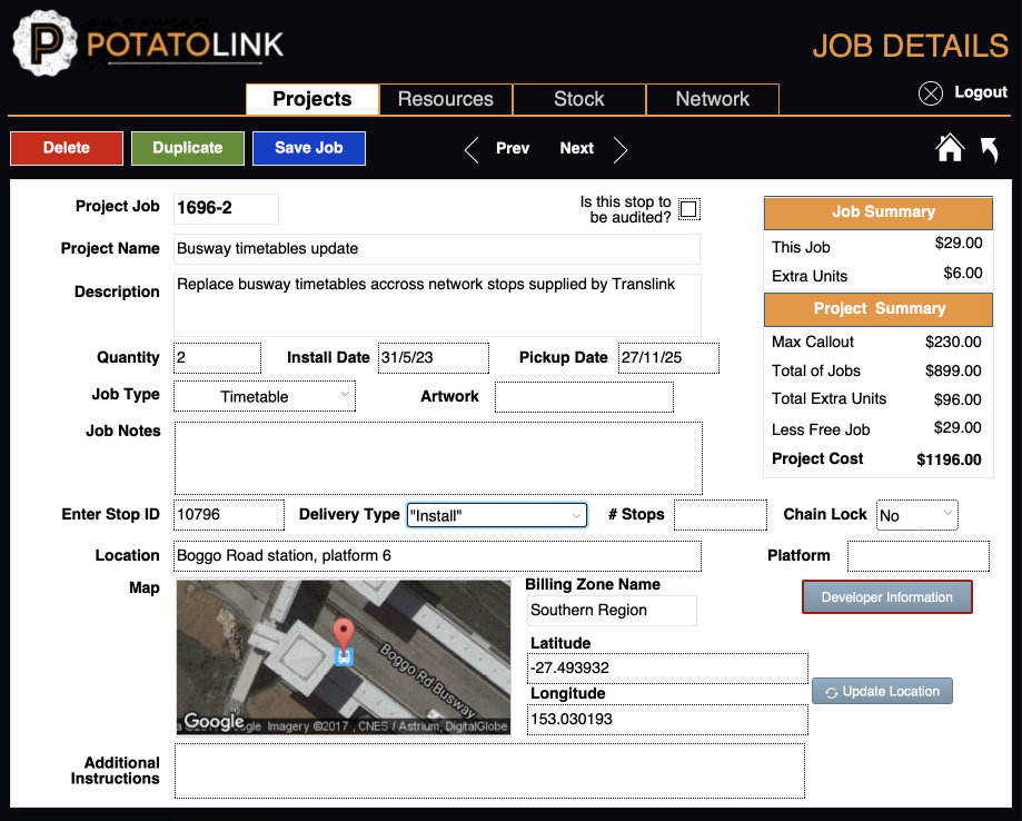
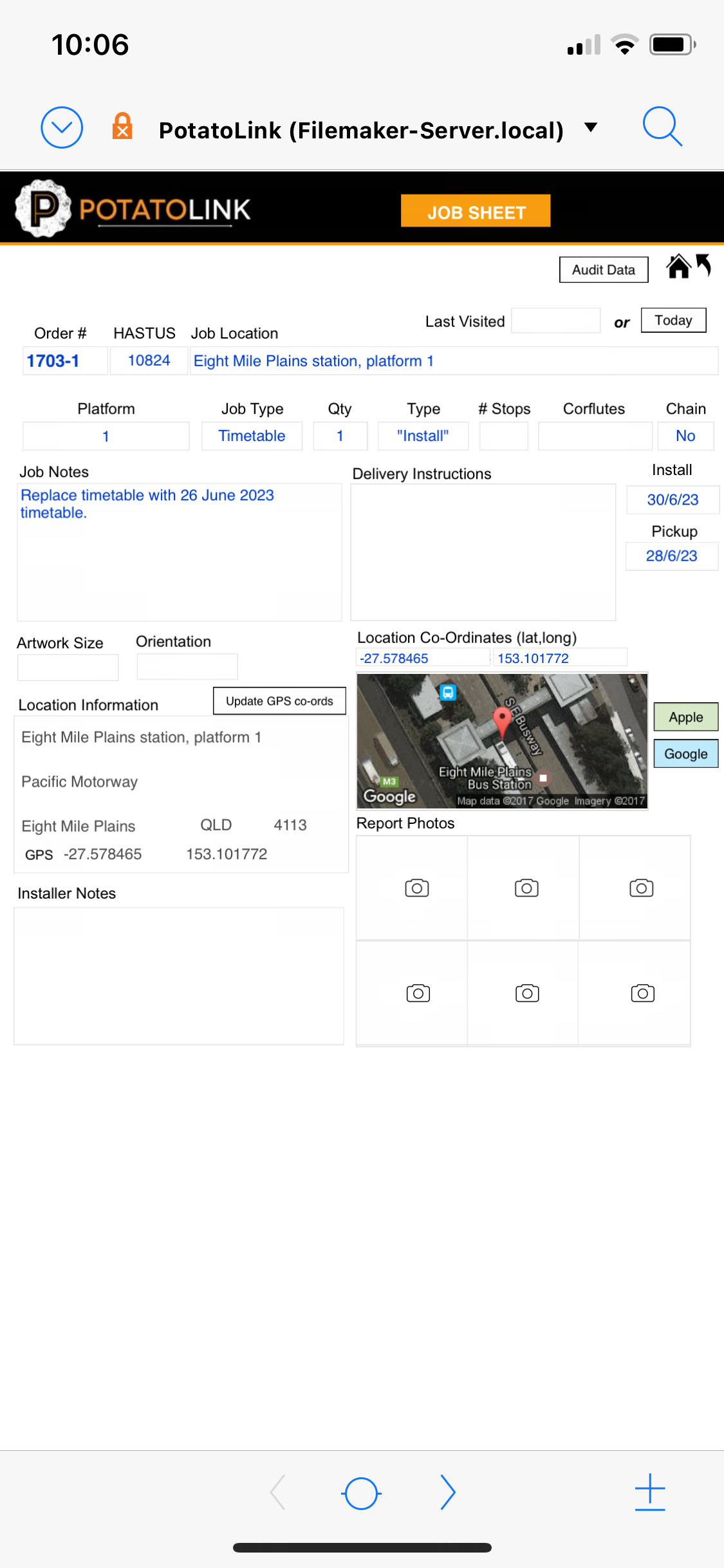
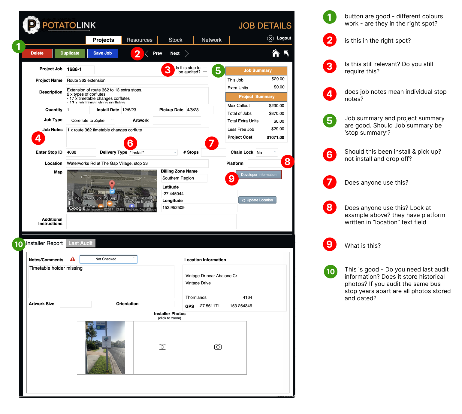
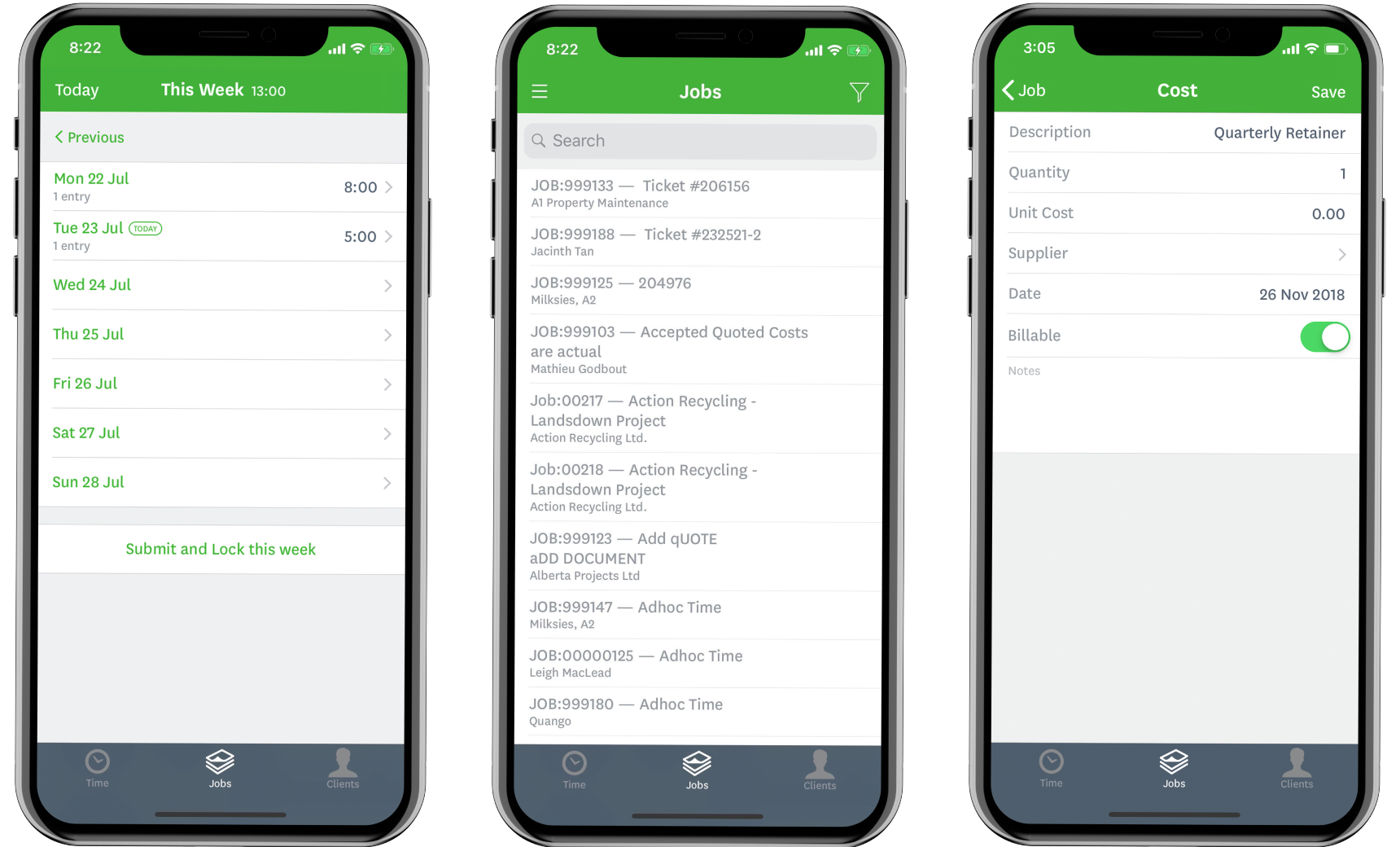
Below are some screen grabs of the exisiting software in the Administrators portal. The administrators only view this software on their laptops or desktop computers.

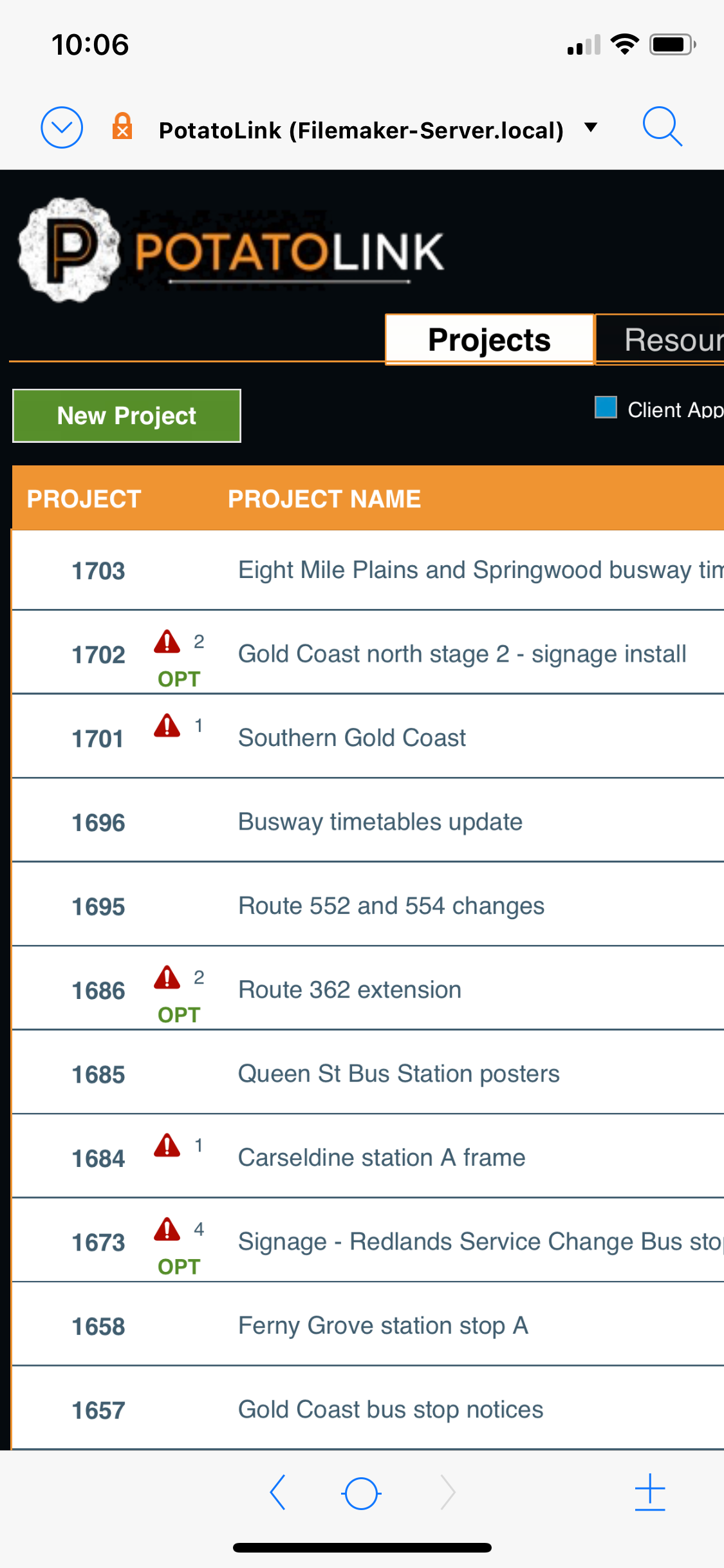
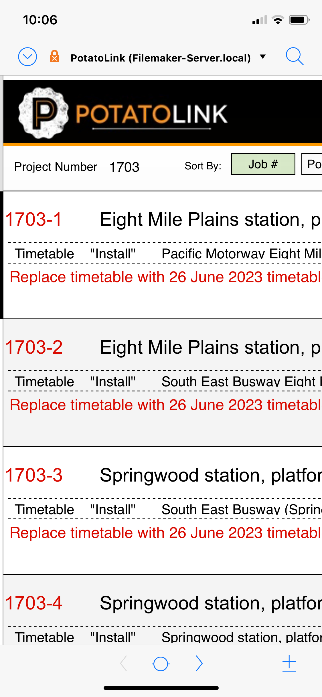
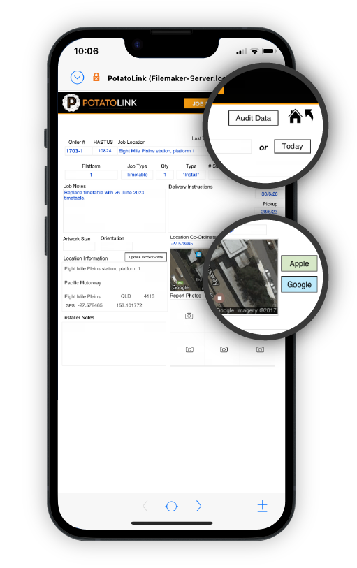
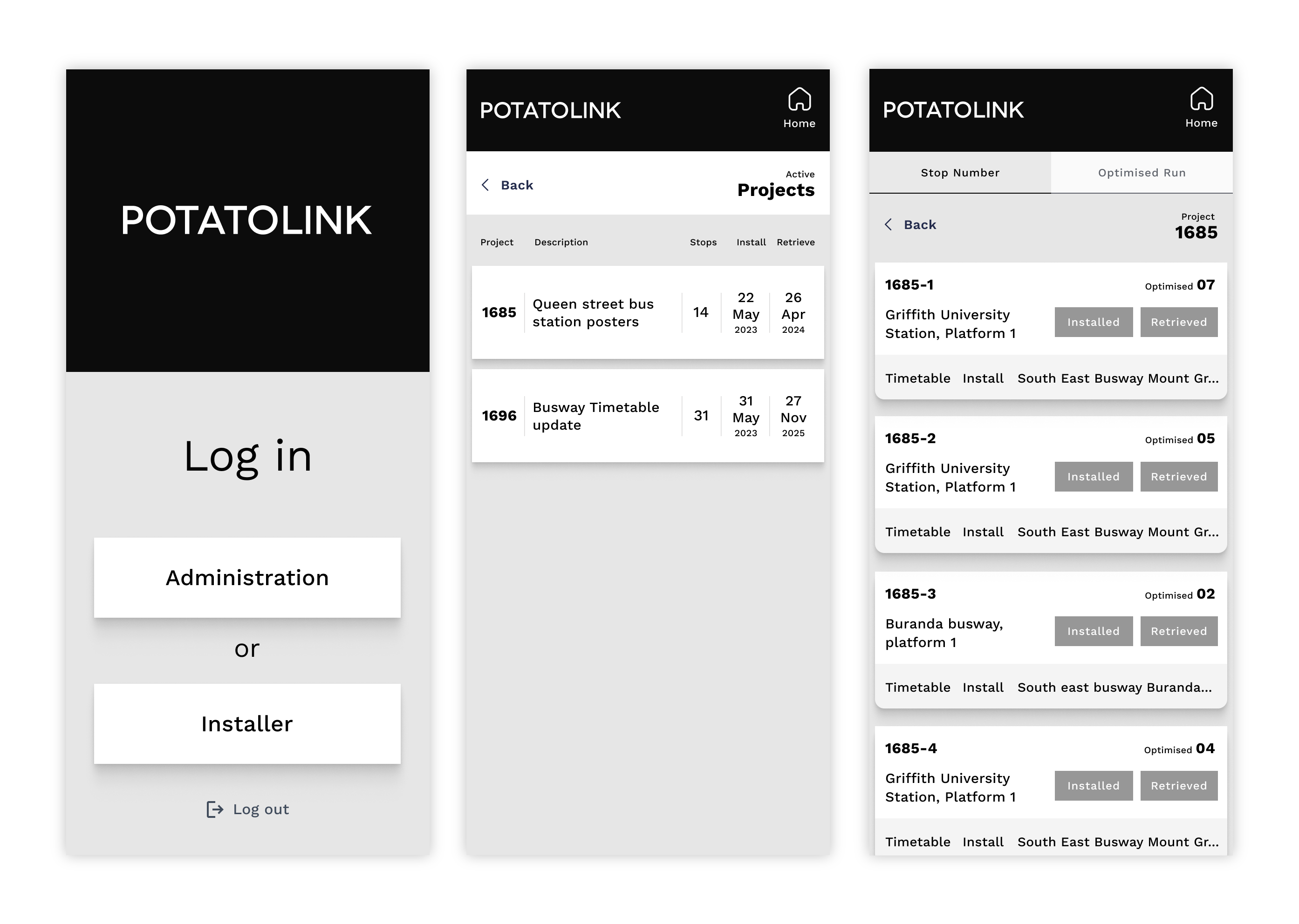
Below are some screen grabs of the exisiting software through the installers portal. The installers view this software on iPads and iPhones whilst out on site.
Problems to solve
A heuristic evaluation was performed to assess areas that could be enhanced or improved. Listed below are the four main areas to address for maximum improvement.

Simplify
Remove all content that is no longer used or needed. This will help minimize the interface and allow a clean appearance. Many legacy assets still occupy space on the interface making it cluttered and confusing. This is an example of one of the pages inside the administrators portal after the content has been analysed and discussed with the stakeholder.

Break Points
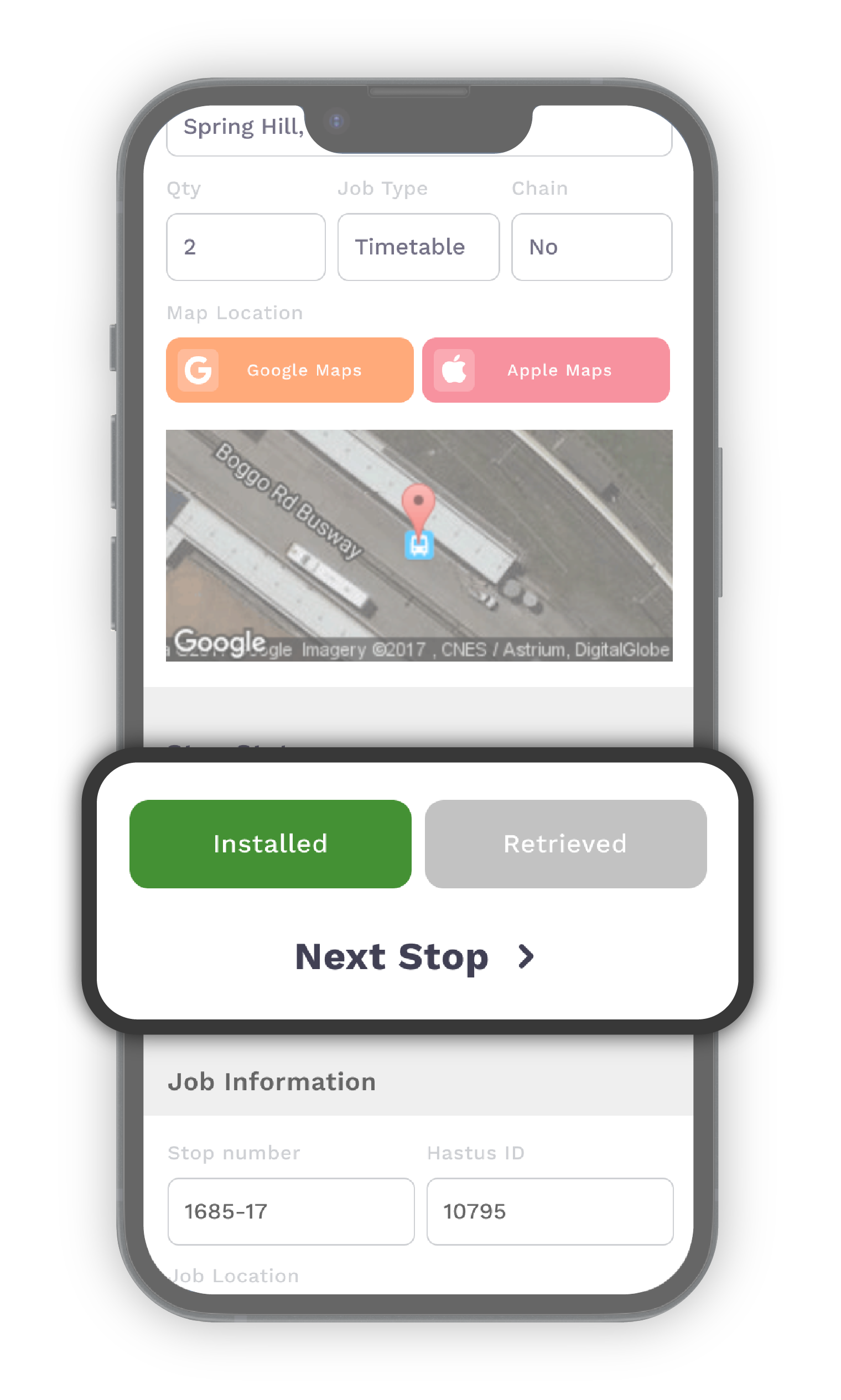
Design mobile breakpoints so that installers will not have to scroll or zoom to use software properly on mobile devices. This will help save time for installers on job runs. As you can see in the image, the is one of the few screens that fit inside the mobile frame, yet the buttons are very small and require users to zoom or have a high error rate whilst trying to click the correct button.

Iterate
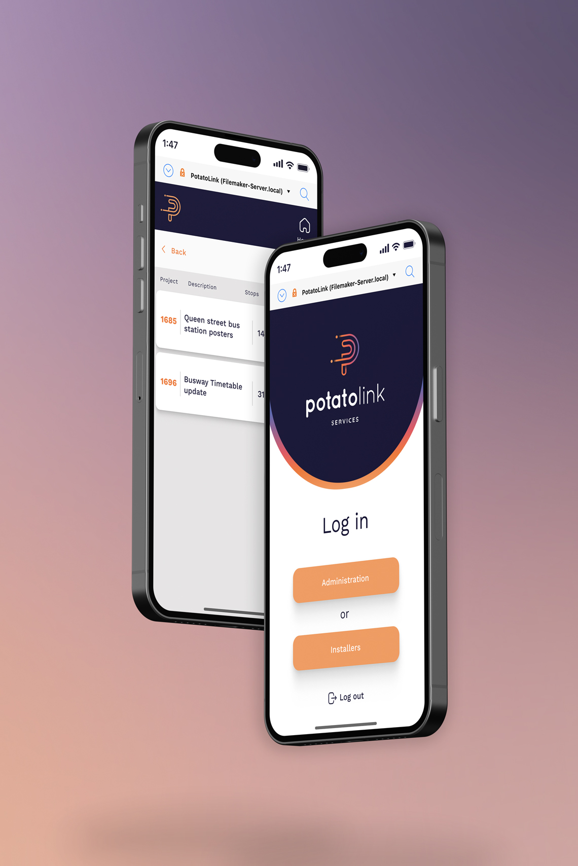
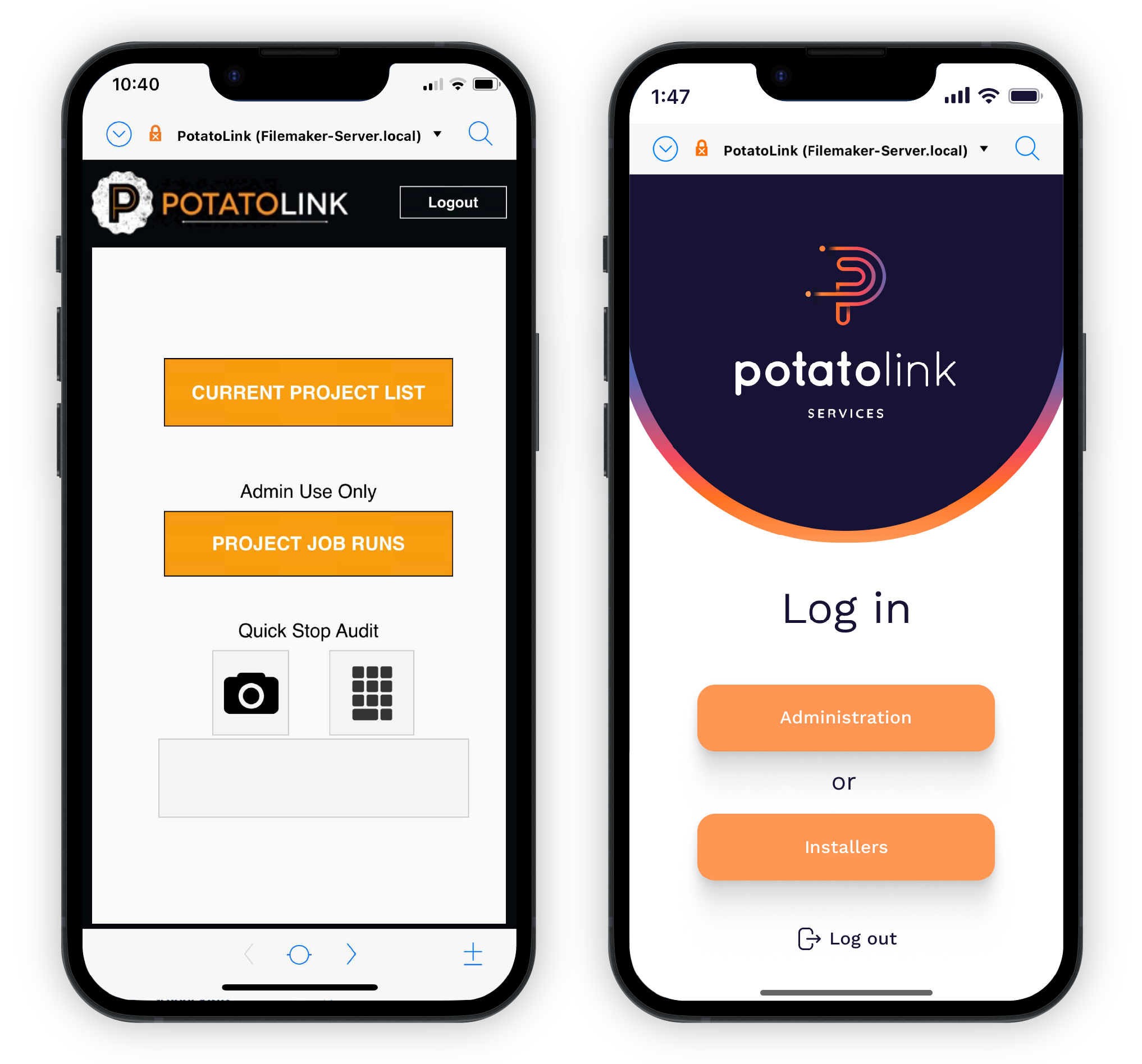
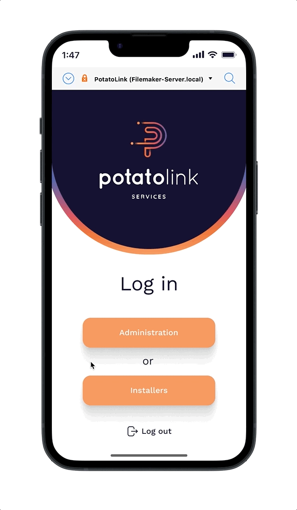
Iterate navigation and employ UX writing skills to make software easier and consistent for users to understand. For example, the log in landing page makes it quiet confusing as to which button logs into which portal. 'Project job runs - admin use only' is actually for the installers. Inconsistent terminology makes it difficult for users to become familiar and confident with the software.

Refresh
Create a new brand identity and design system to refresh the brand and allow for a more modern look. Redesign the interface to ensure accessibility measures are met, eg buttons are large enough. Tidy up the interface and allow for content chunking so that users can easily find the information they are looking for.

User Insights
Secondary users (installers) have minimal time on site to understand job information before moving to next site. The job runs are time sensitive and are performed at all hours of the night and day. They have to be quick to get into the bus stops before a bus pulls up behind them and this means that they need to quickly mark off the stop as complete and log any issues within a very quick time frame. The mobile and tablet interface redesign must be very clean and easy to use on site to ensure maximum efficiency.
User Flows
The exisiting user flows were plotted out for both the adminstrator and installer portals to see where we could iterate and simplify. During this process a valuable time-saving solution was uncovered. Initially, the installers followed a process where they visited each stop on the map, returned to the main list, marked off the installed site, and then proceeded to the next stop. However, an improved approach suggests that they could proceed directly to the next stop without the need to return to the main list.
Competitor Analysis
A moodboard was collated to set the visual direction, while a competitor analysis provided insights for differentiation and industry best practices. Workflow Max, a job management software, was a huge inspiration for the redesign of PotatoLink. Specifically, Workflow Max's effective utilization of content chunking and list views to organize job information served as a valuable reference.
Mobile First
After iterating the user flows and completing some basic paper-prototyping, a mid fidelity prototype was completed so that testing could occur. Designing mobile first would be essential so the installers portal for mobile devices was the first task. There was still a lot of information that needed to be conveyed to installers, even on a small screen, so if this was done correctly, it would set up successfull foundations for the rest of the UI redesign.
Key Features
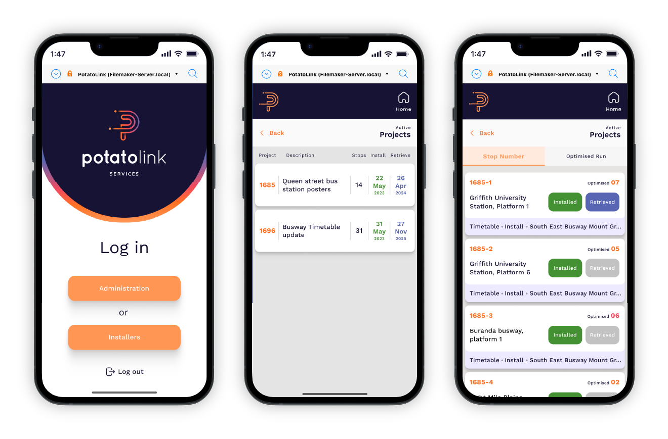
The installers portal redesign incorporates three essential features designed to maximize efficiency for the installers:
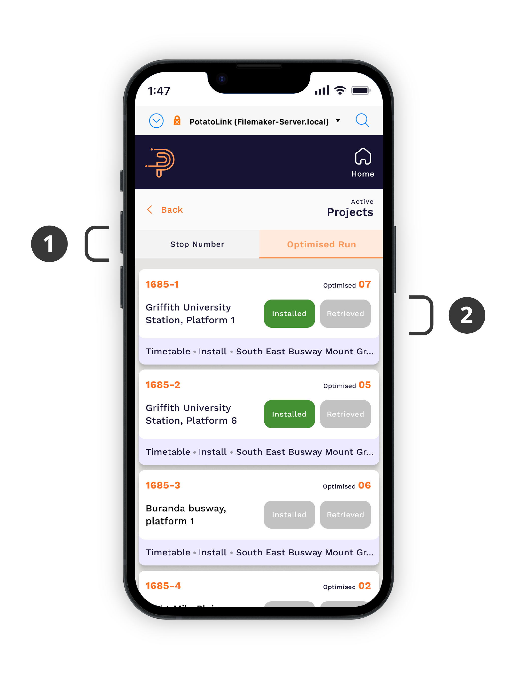
- Filtering/Ordering Job Run: Installers have the flexibility to filter or order their job runs based on either the stop number or an optimized Google Maps route. For larger projects, administrators can upload an additional CSV file into the system, enabling installers to follow a route that has been optimized by Google Maps. This approach ensures that installers can navigate the most efficient route on the map, rather than simply going stop by stop. Users can easily toggle the filtering tabs to select their preferred view of the job run.
- A significant improvement for installers is the capability to advance to the next stop without the need to return to the main job run. As mentioned earlier, this enhancement empowers users to optimize their time and minimize unnecessary back-and-forth movements. User can also mark these stops off individually on the main job run list.
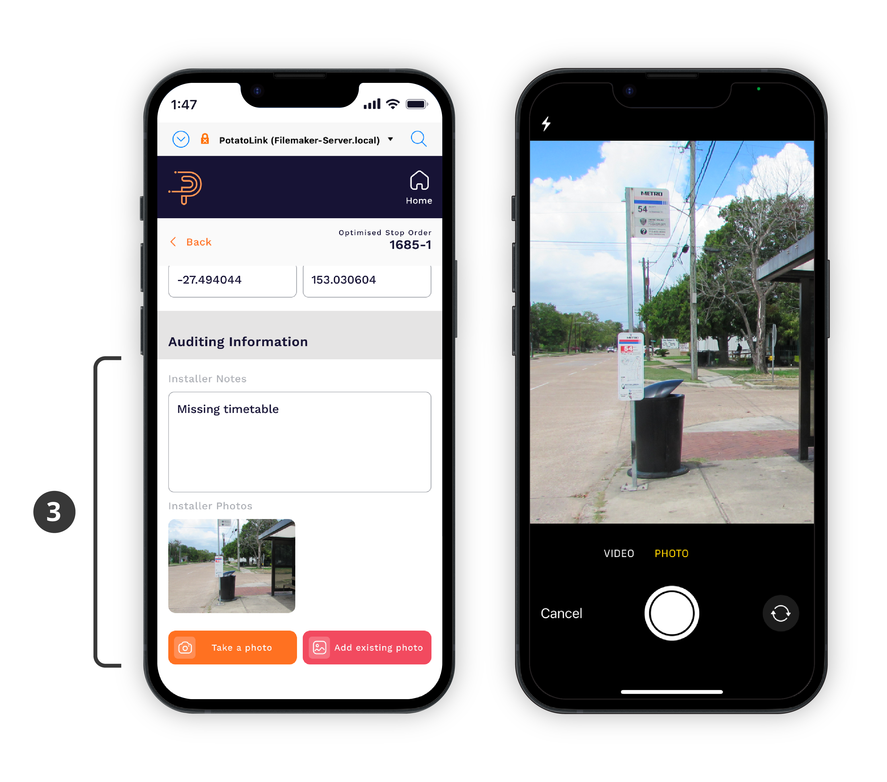
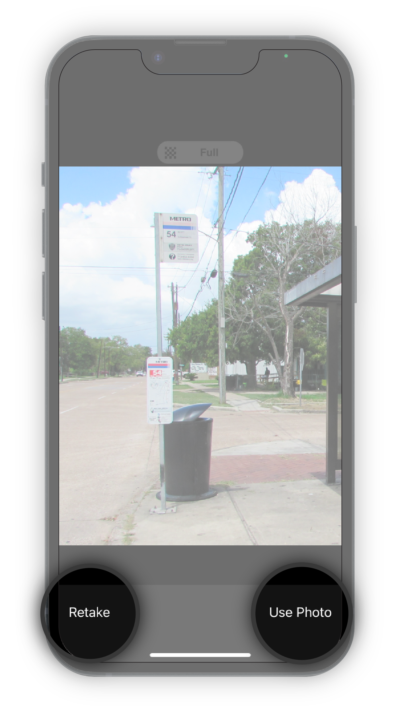
3. The last crucial feature is the capability to capture and log photos of any issues encountered on site directly into the stop. Installers often come across various issues such as graffiti and vandalism, and this feature simplifies the process of documenting these auditing photos. Installers can effortlessly capture a photo using their device, download an existing photo to their camera roll, or delete a photo directly within the stop. This functionality ensures that all visual information is seamlessly logged and easily accessible.
User Testing
Prioritizing the design of the installers portal was most logical approach, given that this particular user group expressed the highest level of concern regarding a redesign. These users do not identify themselves as digital natives and have acquired their proficiency in using the current software through self-teaching and trial and error rather than an innate ability to navigate the system. Therefore, it was crucial to thoroughly test the new mobile design to assess their natural ease of navigation within the updated interface. A user testing plan was devised to evaluate the success of the new interface.
3 out of the 5 tasks were completed with 100% success rate.
The installers also navigtated the new UI with ease. One installer inparticular was nervous going into the test, but once he was able to complete the tasks he was relaxed and gave great insight into some changes that could be made. This was an exciting feat and helped prove the success of the redesign.
Room for Improvement
The biggest finding in the user tests were issues around the photo auditing features. The mid-fidelity prototype was not giving users enough feedback after they had taken the photo to let them confidently know the photo had been logged into the stop. This was iterated upon in the high-fidelity prototype to allow users to re-take a photo or choose photo so users could be confident the right photo was logged.
Brand Identity
To align with the evolving nature of the company as it transitioned towards software-based services, a new brand identity was crafted. The branding strategy was carefully designed to embody a tech-oriented aesthetic, reflecting the company's focus on technology-driven solutions. This updated brand identity aimed to resonate with the target audience and convey the company's expertise.
Prototype
Please feel free to explore the mobile Hi-fidelity prototype for the Installers portal.
You can expand the screen by using the button on the top right hand corner.
Next Steps
I am currently building out the ipad breakpoints for the installers portal whilst working with the developer to bring the mobile frames to life. Once the installers portal has been completed, the process will begin on the adminstrators side.
Selected Works
PotatoLinkUX / UI Redesign
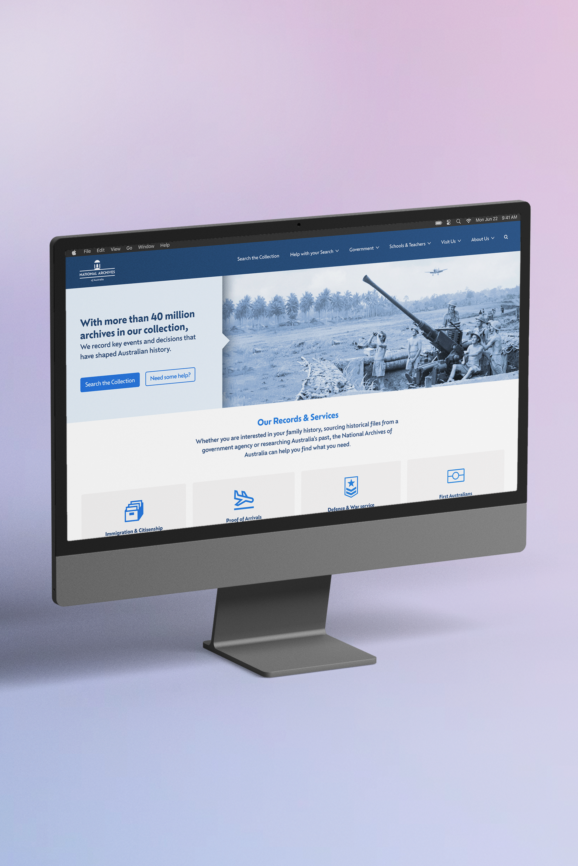
National Archives of AustraliaInformation Architecture
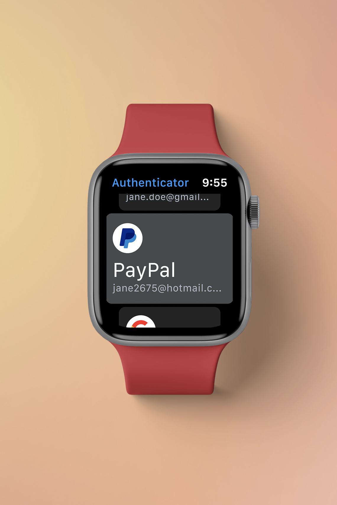
Google AuthenticatorSmart Watch Design
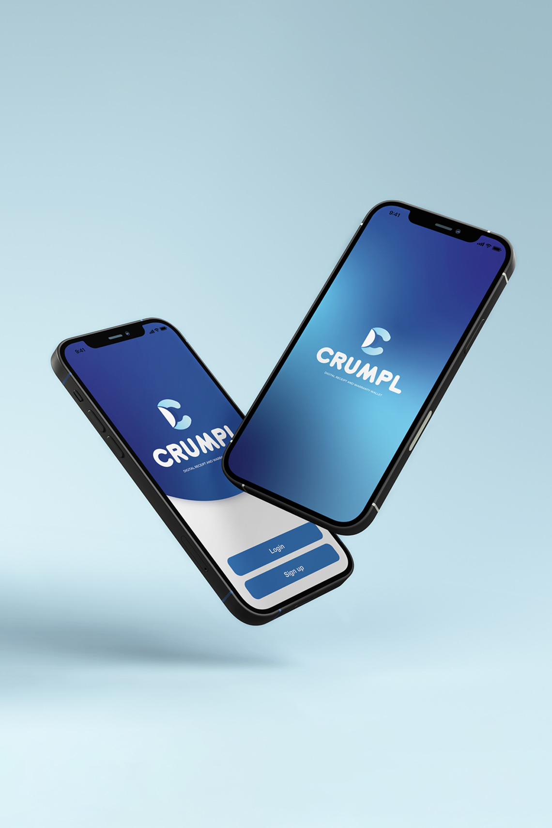
CrumplPaper Receipts in a Digital World
Contact
© Toren Vansleve
Gold Coast,
Queensland, Australia
Email: hello@torenvansleve.com
Linked in: www.linkedin.com/in/toren-vansleve