Google Authenticator
SMART WATCH DESIGN

With the rise in popularity of smart watches, there is ample opportunity for existing apps to extend their scope and offer users a more rounded experience.
An app I use daily on my phone is the Google Authenticator App. It seems that almost every website now needs a two-step verification method so why not have the ability to quickly access this on a smart watch?
TIME: 1 Day
TEAM: T. Vansleve
ROLE: UX / UI Design
DATE: June 2023
Project Goals
The goal of the project was to simplify the existing Google Authenticator app for use on a smart watch. Just like in smartphones, the role of haptics has grown into a core component of the user experience so this would be an essential feature to include in the redesign.
Tools & Methods


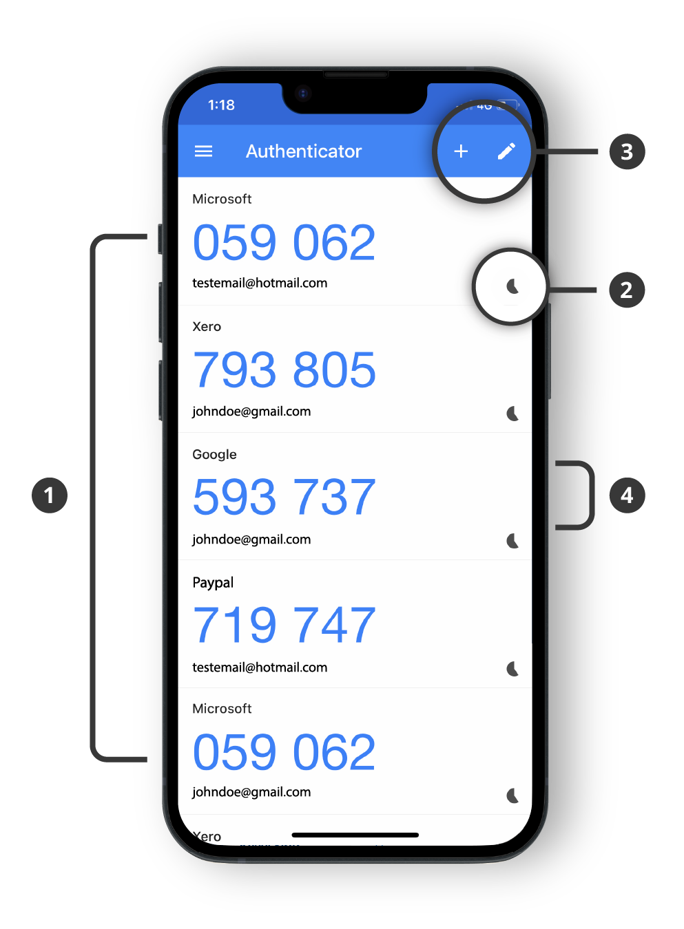
Google Authenticator adds an extra layer of security to your online accounts by adding a second step of verification when you sign in. This means that in addition to your password, you'll also need to enter a code that is generated by the Google Authenticator app on your phone.
Key Features
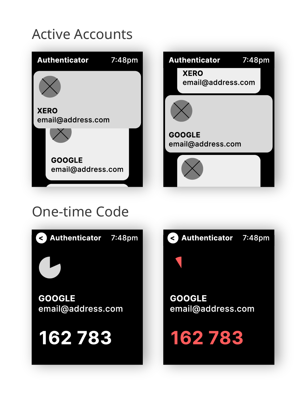
The Google Authenticator app is very simple and easy to use. The current features the Authenticator app can achieve are:
- Scrolling through the list of active sign in accounts
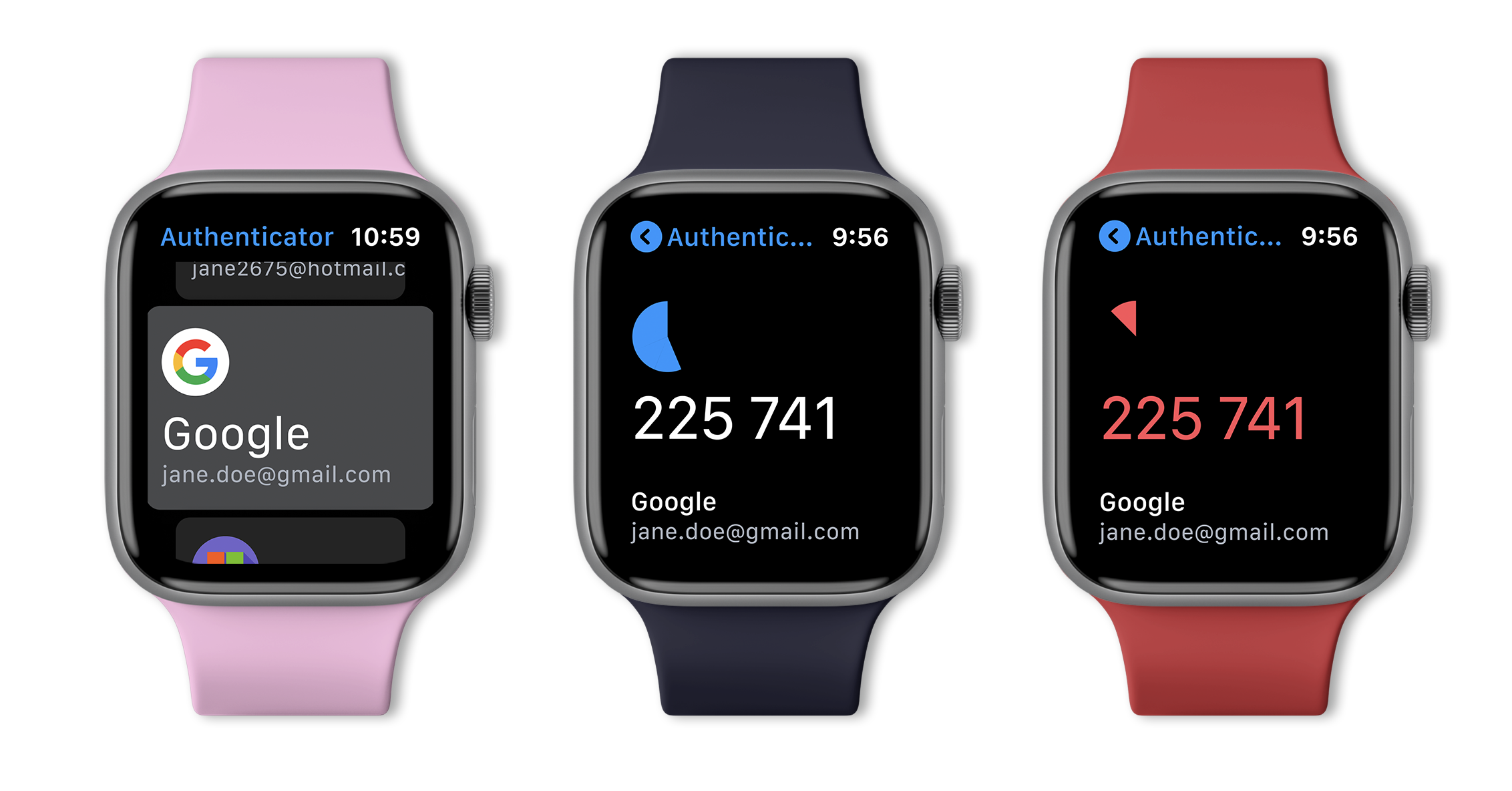
- A count down timer wheel so the user knows when the code will expire
- Add new accounts and delete old accounts
- Copy the one-time code by tapping the 6-digit number code
Keep it simple
After analyzing the key features, it was decided that not all of these need to be included into the smart watch interface. For instance, adding and deleting accounts seemed to be an arduous task with such a small screen as most accounts are added by scanning a QR code with the camera on a phone, making this feature redundant on a watch.
User Flow
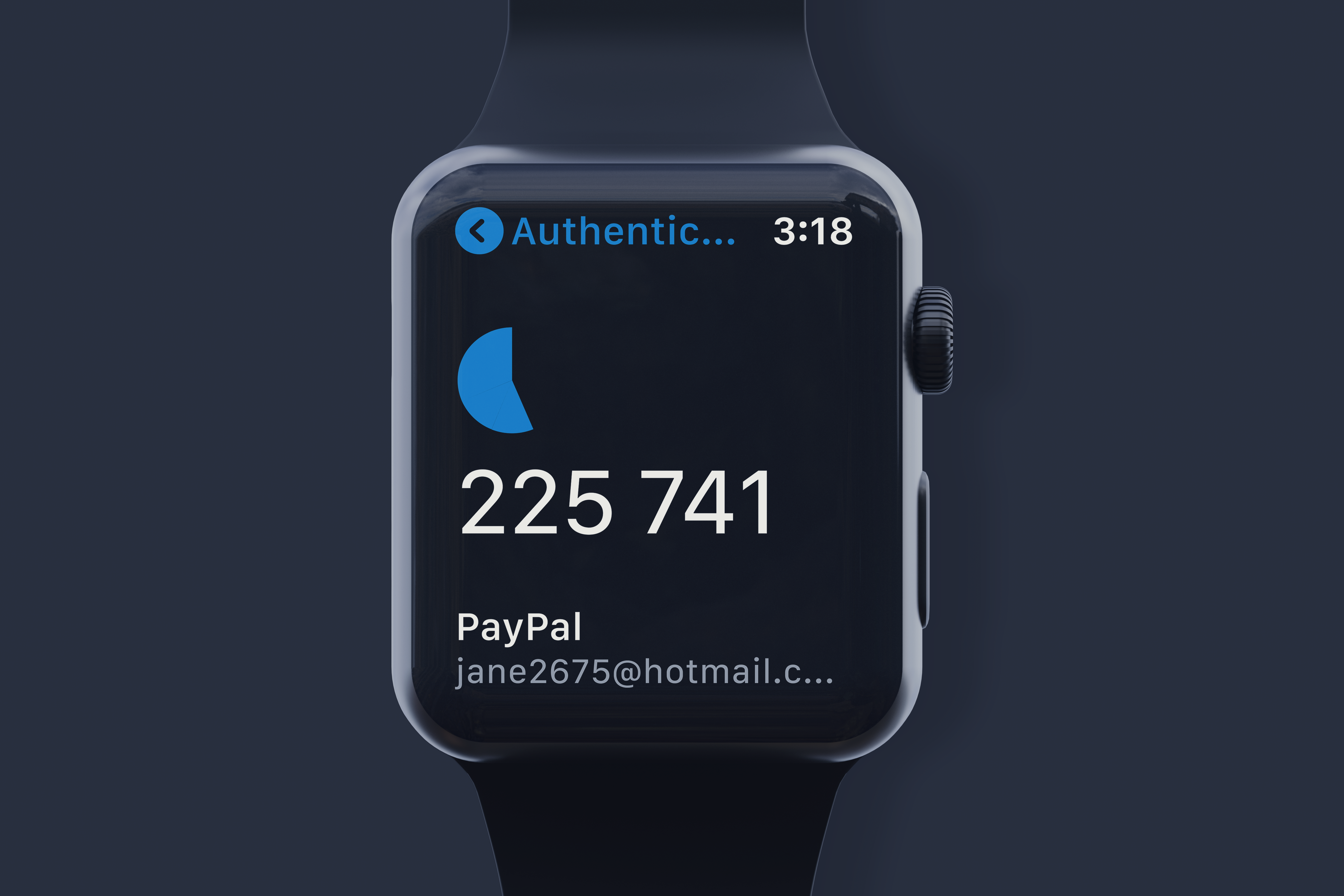
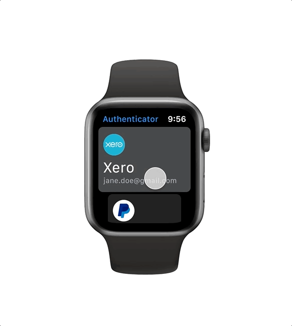
There is a small amount of real-estate on the screen to play with and for accessibility reasons the typography would need to be large and the colors should be limited. This would help users to quickly view the 6-digit code as clearly as possible with a low error rate when logging in.
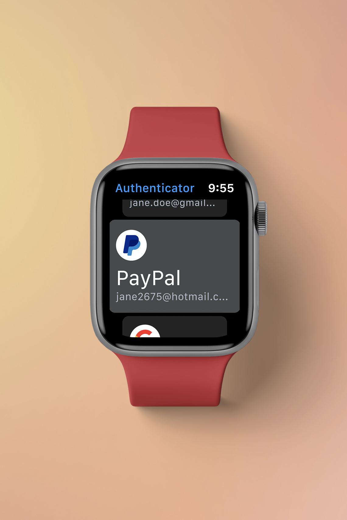
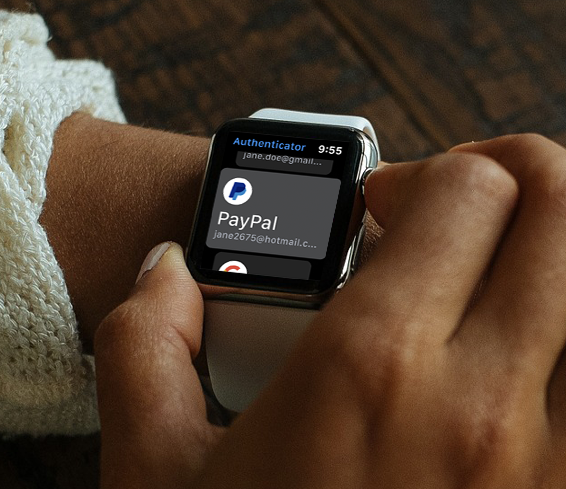
After completing the initial research it was understood that keeping the user flow as minimal as possible would be the key to a successful design. The wireframes were designed around no more than 2-3 levels. The new UI design would only have the ability to scroll through the active accounts and view the one-time code.
Dark Mode
As the user only has a short time period to enter the code, the 6-digit numbers needed to be as legible as possible. A dark interface is easier on the eyes in low-light environments. Additionally, Smartwatches utilize dark interfaces to optimize battery performance by minimizing power consumption. The darker the interface, the lower the energy usage of the device.
User Interface
How were we going to help users scroll through their active accounts quickly to find the code they need?
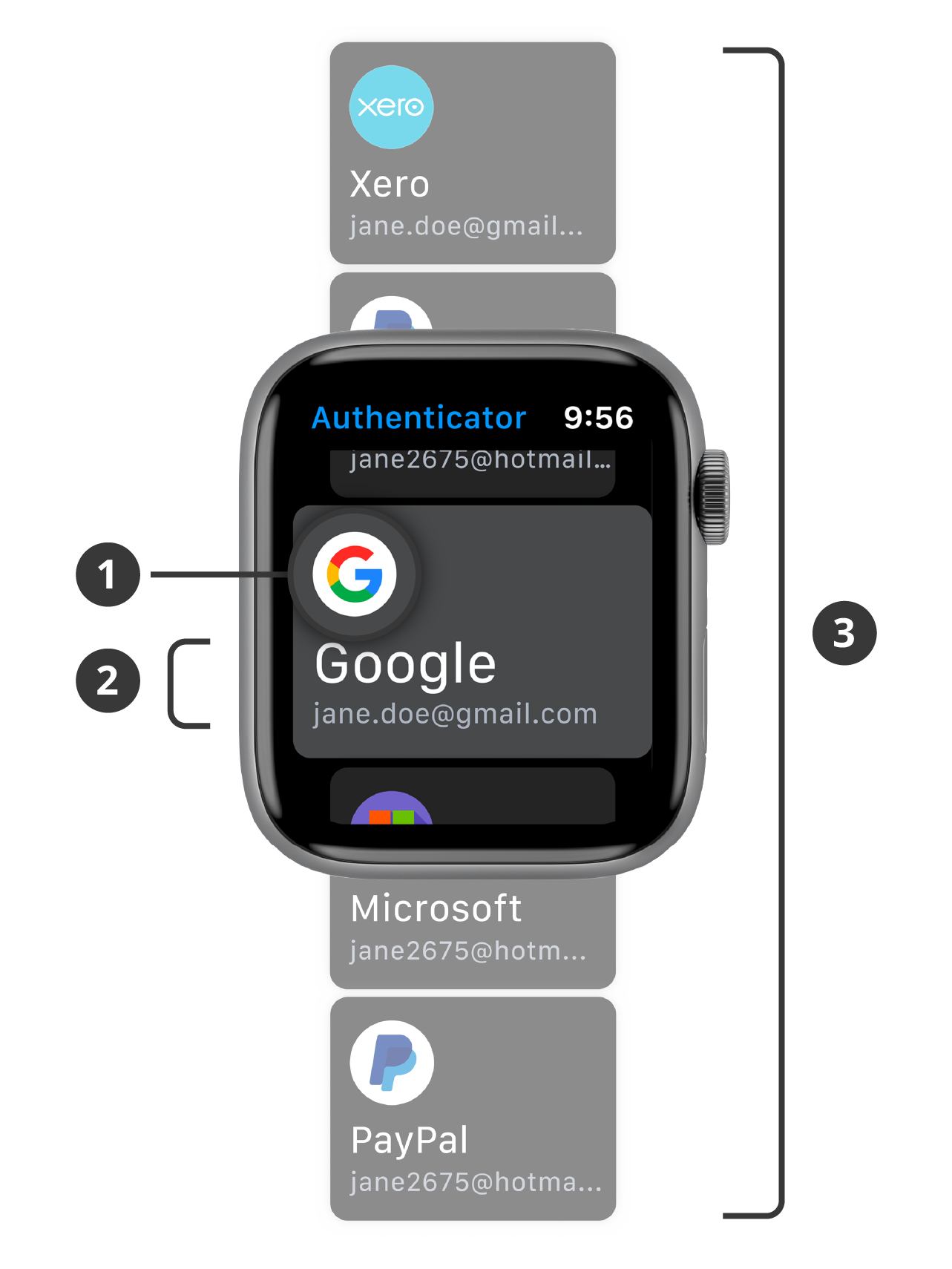
- Large icons are important. They help signify quickly to users what account this card was for even when they are scrolling quickly.
- San serif fonts were used so the text would be as large and legible as possible, even at a glance.
- Using cards was an important UI decision that was made early on. Cards allow for signifiers, such as shadows, which shows the user that this card can be moved or in this instance scrolled. The cards also use perspective, the card that is currently in view will be larger and all other cards in the background will be darker and smaller to show the viewer these are out of range. This will help users select the correct card and reduce unintentional selections on the small screen.
Haptics
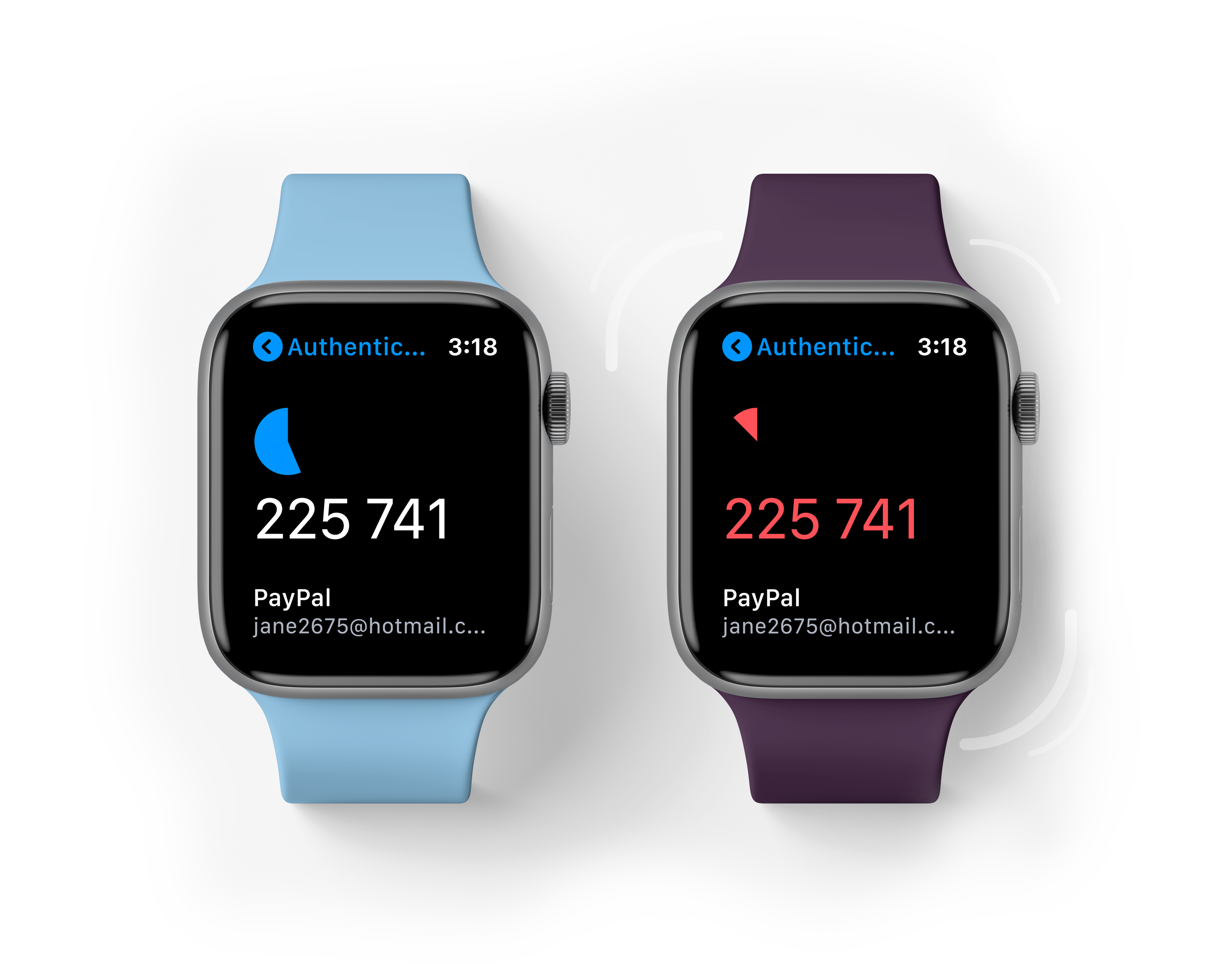
Vibration haptics will discreetly notify users when the time sensitive codes are expiring. The vibrations and use of red colour will provide a subtle way for users to stay connected in situations where audible or visual alerts are inconvenient or inappropriate. This will also help users minimize the amount of wrong codes typed into their login accounts due to the code expiring without warning.
Final Thoughts
Overall, I believe this design provides users with easy access to an app most would use multiple times a day. Introducing more haptics to the scrolling between cards could add another signifier for users. This will allow recognition of accidental movement on the app in case the user is unaware or the home screen is not locked.
Prototype
Please feel free to explore the Hi-fidelity prototype.
You can expand the screen by using the button on the top right hand corner.
Selected Works
PotatoLinkUX / UI Redesign
National Archives of AustraliaInformation Architecture
Google AuthenticatorSmart Watch Design
CrumplPaper Receipts in a Digital World
Contact
© Toren Vansleve
Gold Coast,
Queensland, Australia
Email: hello@torenvansleve.com
Linked in: www.linkedin.com/in/toren-vansleve