National Archives of Australia
INFORMATION ARCHITECTURE

The NAA is a Government organisation that has an astonishing online collection of Australia’s historical events, yet after a thorough analysis, their website structure is hindering user’s to properly navigate the website.
How can we help users understand how to navigate the website so they can get the best out of all the features and collections the NAA has to offer?
TIME: 4 weeks (1 week sprints)
TEAM: Sarah Halley (UX)
ROLE: UX / UI & Branding
DATE: October 2022
Project Goals
A challenge going into this project for our team was time, so we had to be resourceful of where focused our energy. We agreed the priority was to focus on the navigation inconsistencies and a homepage redesign.
Our team endeavoured to research and understand the confusion and pain points users are experiencing whilst navigating the NAA website and to re-design the UI to make the user’s journey a seamless process.
Tools & Methods


User Flows
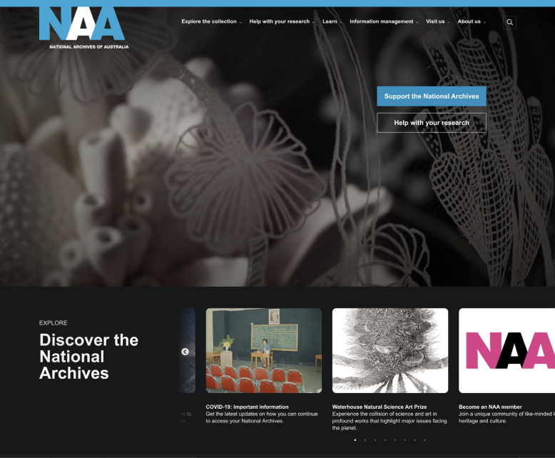
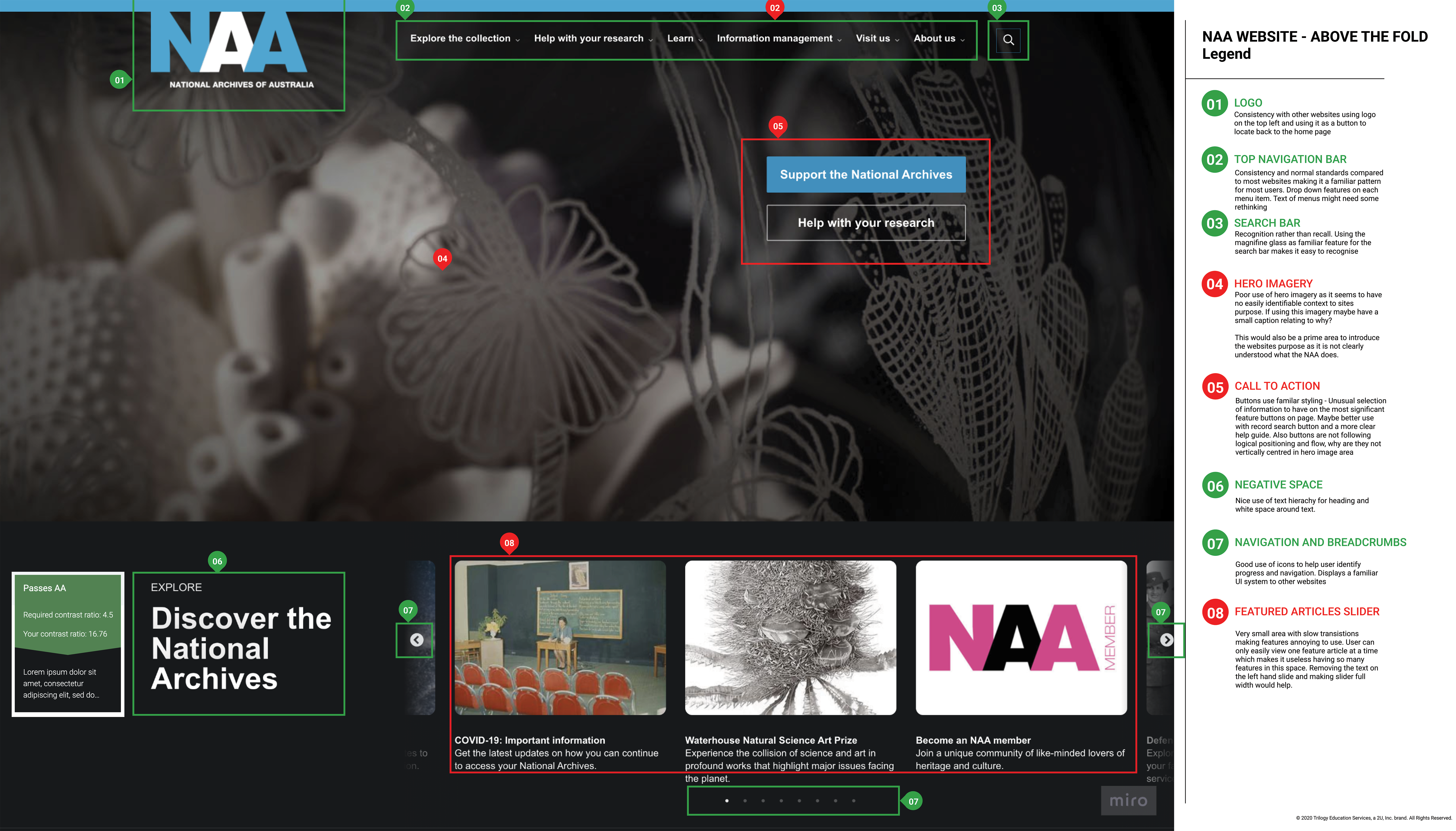
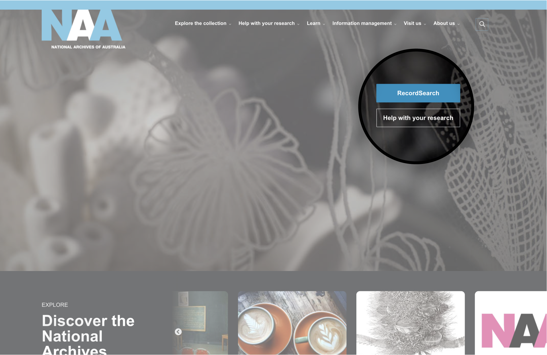
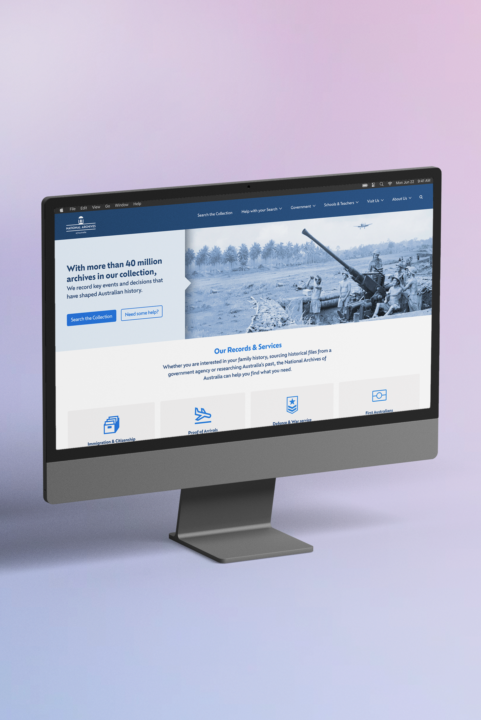
After creating a proto-persona, we plotted out user paths to complete simple tasks on the existing NAA website to get a better understanding of how users would navigate the site. The main feature of the NAA website is the ‘record search’ function. The current site had no visible CTAs above the fold making it difficult for user to easily identify where to go.
Heuristic Evaluation
We executed a thorough heuristic analysis so we could start speculating which aspects of the site could be improved. Our biggest finding with the current interface was the inconsistencies with buttons, branding and content layout which we believed was making the site difficult to scan and navigate for the users. This ultimately would result in users becoming lost on the site and potentially increasing the bounce rate.
User Testing
We developed a user testing plan to evaluate how the website is currently being used vs the user flows that we plotted. After testing our users it was apparent that the main areas of confusion were mostly centred around poor terminology of headings and navigation. The biggest issue we found is that the main “Record Search” function button is below the fold. Based on our user tests, our users didn’t really scroll on the homepage and therefore completely missed the record search button all together. This was a vital insight and helped us to understand our users behaviours and design for how they were actually using the site.
The record search is arguably the website's main feature, therefore ultimately we believe it is failing its purpose.


What did we learn?
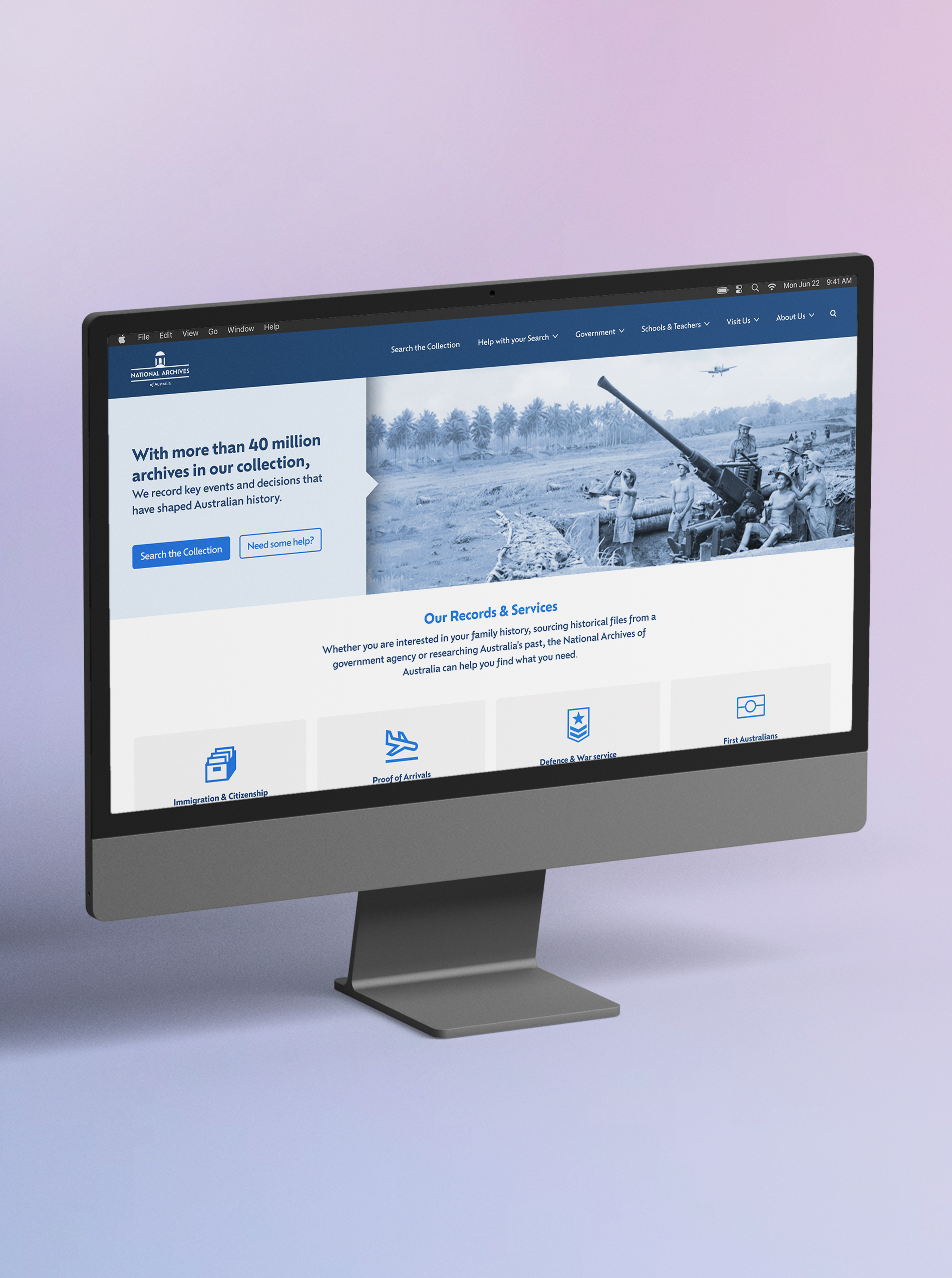
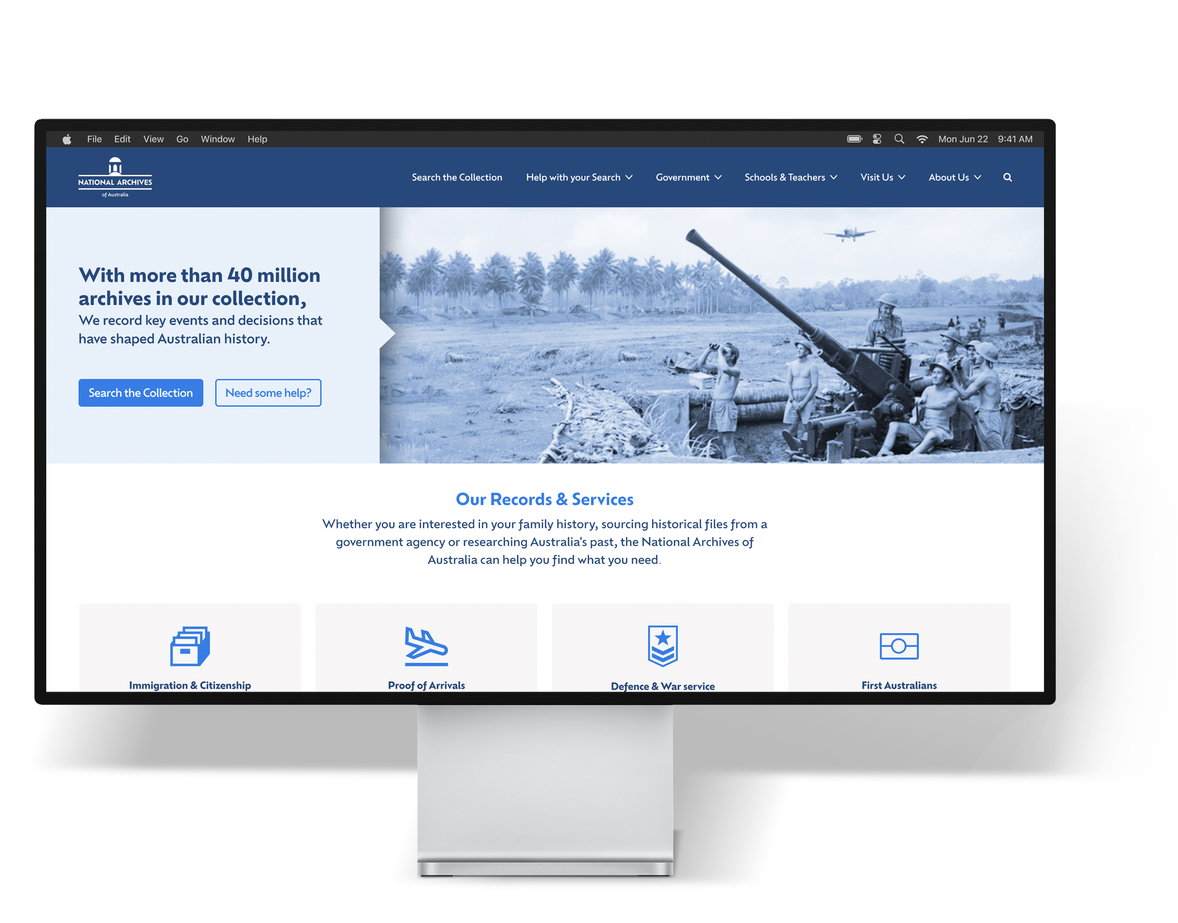
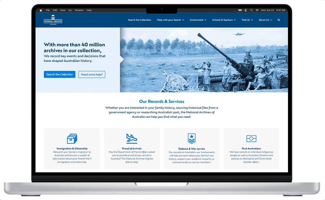
After user testing the current NAA site, it was obvious that the most success came from the CTAs on the hero section of the page. We tested both a younger and older demographic and in both groups the CTAs helped users to achieve the set goal so we knew this would be an important feature we wanted to keep moving into the redesign.
Information
Architecture
After testing and interviews it became apparent that the terminology desperately needed to be iterated as the primary menu headings did not describe what the drop down menus hold. In fact 60% of users were reading every single secondary drop down menu item in attempt to complete the tasks we set for them. This was very time consuming and lead to navigation failures. We completed card sorting tests to re-design the site map and perform initial wireframe testing.


A New Style
Before prototyping the website design, the UI components needed to be designed to ensure the look and feel of the new NAA interface was inline with the values and purpose of the website. The design of this website must be a reflection of the Australian Government, it must be seen to be trustworthy and reliable. The website is used by a range of different demographics, so the design and usability should be placed in the forefront over trendy design features.
TRUSTWORTHY. RELIABLE. HONEST.

Imagery & Typography
Historical imagery will be used as feature banners across the site - the modern blue wash is a take on the historical sepia tone photograph. The typography used is a sans serif font to bring a modern contrast to the historical imagery found of the website, it is also a clean font which will allow users to scan the text easily.
Service Cards
Majority of user’s did not understand the purpose of the NAA site. To help user’s digest the large amount of services, “quick link” cards have been used throughout the home page. The icons help break up the large text areas and allow user’s to quickly scan for what they need.

New Navigation
A cleaner and leaner navigation menu was implemented. Search the collection has now been broken down into two primary headings. A expanding search bar also keeps the design clean but user friendly.
Please use the toggles to view the before and after.


Final User Testing
Several more user tests were conducted to determine whether or not users can navigate through the new UI of the NAA homepage successfully. Tests were completed on both mobile and desktop prototypes. By changing the ‘record search’ function to a button on the feature banner, 4/5 of the users found the record search function instantly.
As a whole, the user’s passed with 86.67% over all tasks.


Full Case Study
This page is a summary of my full case study, if you wish to see the research in full, please use the button below.
Final Notes
There were a few users that were unsure about the war imagery, this banner can be amended to have a rotating carousel of images to showcase the different archives stored at the NAA. It was also identified that a few users go straight to the search bar to navigate. Potentially a static search bar could be implemented and tested.
Selected Works
PotatoLinkUX / UI Redesign
National Archives of AustraliaInformation Architecture
Google AuthenticatorSmart Watch Design
CrumplPaper Receipts in a Digital World
Contact
© Toren Vansleve
Gold Coast,
Queensland, Australia
Email: hello@torenvansleve.com
Linked in: www.linkedin.com/in/toren-vansleve